Monday, June 15, 2009
Logo Design
Tuesday, April 14, 2009
Pentool Logo Design
1. Name of your company, a short paragraph describing what your company manufactures/sells and the target audience for the product.
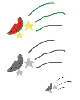
The name of my company is called Starfruit. My company sells a product called “fruit bursts” which is a chewy organic fruit snack with liquid filling in the middle, which bursts when the chewy part of the snack gets bitten into. The product contains vitamins that kids don’t usually obtain from chewy candy-like fruit snacks. The target audience for this product is anywhere in between toddlers and young children.
2. Review the processes that Jacob Cass went through in designing his logo and Logo Design Secrets (and any other links that you found especially helpful). What parts of these processes did you use in your work. Please explain and be specific.
Knowing the rules and principles of logo design was very helpful in creating the logo. It talks about “describable, effective without color, memorable, and scalable” The logo has to describe what it is representing. Although sometimes, the logo isn’t what the product is, if it’s not affective of attracting the target audiences, there is no point. Effective without color truly shows if your logo is successful or not, because it shows that the target audiences remembers what your logo is, and what it represents. Which shows the popularity of your product. It brings me to my next point of having it be “memorable” really shows the popularity of it. For example, many people remember the McDonalds’s symbol, and the Nike’s symbol, because their products are popular. Your logo has to be scalable, because if people can’t understand what it is when it’s small or large, it shows how ineffective your logo is.
3. Overall, what three important concepts have you learned about logo design? Explain why they are important to your future work?
The three important concepts that I have learned about logo design is that it has to be simple while attracting the target audiences. I also learned that attracting the audiences without color is a great part in designing a logo. Simplicity always seemed very important to all the designs we have created. It’s the same idea of getting out what we’re trying to say concisely. Attracting the target audiences without a colorful logo is very important, because it shows if your logo is affective or not. Also, if your logo has to be affective without color, I think it’s best that you use an unique universal symbol, or a picture.
4. Review the criteria and the process of designing a logo, please rate your final logo design, 1-4 (4 is the highest). Please explain why your work deserves the rating.
I would give my logo about a 3.5 on a 4 scale, because I’ve used all the principles of creating a logo. I’ve brainstormed my ideas, got feedback, and edited my logos. I’ve also tried to fit it so that I can attract my target audiences, who are anyone in between toddlers and young children. The best part about what I did is that I didn’t focus on just the one idea I have started with. I took the feedback from the class, and made it so that the logo would be better. And I utilized my time in class by researching on products that toddlers and young adults might enjoy.
Thursday, April 9, 2009
Reflection on Logo changes
1. What significant changes has your logo gone through?
First, I started by drawing bunch of asparaguses to represent the company name, “Asparag-us”. But now, it’s just the word asparag-us with the picture of an asparagus on it.
2. Why did you make these changes?
I realized that it looked really messy and I changed it to just the word asparag-us with an asparagus underneath it. I’m thinking about not adding colors to the word, but to the asparagus.
3. How much more work needs to go into the logo? What more do you need to do? (Please check criteria)
I need to find the suiting font for the word asparag-us and the proper color for the actual picture of the asparagus. And also find a suitable size for both of them. I’m also thinking about switching up some ideas.
4. What questions do you have?
I don't have a question at this moment.
Friday, April 3, 2009
Quarter 3 Self-Assessment
What are you most proud of? What do you think are your strengths?
I’m proud of the fact that during the first quarter, I learned how to design on photoshop, when I couldn’t do that before. It shows the improvements that I have made in this class. I think my strengths are practicing the given tools, and exploring other tools to use in photoshop. I also like the fact that I try to use my resources to the fullest. If I don’t understand it, I would search it online.
What would you like to do better and/or focus upon for Quarter four?
I would like to focus on getting better at designing, now that I have the resources and the tools to create the designs. I would also like to get more creative, and inspired by other artists’ work. And I hope that I can spend a little more time on planning my ideas ahead of time, so I don’t waste a lot of time during class. I'll try to focus more on getting my ideas out.
How will you make this happen?
I will try to be more creative, and utilize my time well. Not dwell on just one idea, but explore more about it. Practice more with the tools that we have learned to use in class, and explore other tools. And continue on with being inspired by other cool designs that I see. I will also take more into consideration of the feedbacks given by other students in class.
Monday, March 30, 2009
5 Important Tips In Creating a Logo
1. Remember what a logo is supposed to represent. It’s not just a symbol, it should reflect on what it is representing. It should have a clear meaning to be an effective spokes symbol.
2. The logo must be able to stick in someone’s mind. It has to be able to fit into any description. People usually get drawn to the simplest things… but it also has to be eye catching other words, make it creative.
3. Don’t make the same mistakes that bad logo designers did. Caroline Davidson produced the Nike’s logo for $35, but it’s world’s renowned symbol. It shows that it can be simple yet eye catching.
4. When making a design, don’t copy someone else’s work. Make it creative and be inspired.
5. Practice makes everything perfect, even for creating a logo. Get used to the programs you’re using. And don’t forget to brainstorm on your ideas.
Subscribe to:
Posts (Atom)