1. Remember what a logo is supposed to represent. It’s not just a symbol, it should reflect on what it is representing. It should have a clear meaning to be an effective spokes symbol.
2. The logo must be able to stick in someone’s mind. It has to be able to fit into any description. People usually get drawn to the simplest things… but it also has to be eye catching other words, make it creative.
3. Don’t make the same mistakes that bad logo designers did. Caroline Davidson produced the Nike’s logo for $35, but it’s world’s renowned symbol. It shows that it can be simple yet eye catching.
4. When making a design, don’t copy someone else’s work. Make it creative and be inspired.
5. Practice makes everything perfect, even for creating a logo. Get used to the programs you’re using. And don’t forget to brainstorm on your ideas.
Monday, March 30, 2009
Friday, March 27, 2009
Thursday, March 26, 2009
Tessellation
 Rectangular Tessellation
 Triangular Tessellation
1. Which tessellation did you find more interesting to do? In what ways was it more interesting than the other? Please explain.
The rectangular tessellation was more difficult and it took more creativity to do. Even though it was harder to do, it was more interesting creativity wise. I also liked doing the triangle because we needed creativity to pick the spot of the picture that would make a unique tessellation. Over all, I think the triangular tessellation looks better as a finished product, just because it creates the unique shapes, and the colors go well together.
2. Look at your peers' work on the ning . Which two designs do you find the most successful? What qualities make them so successful?
The two designs I find is successful are Samantha’s triangular tessellation, and Adrian’s rectangular tessellation. Part of Samantha’s tessellation looks as if it’s glowing near the black color on her tessellation. The colors go well together, and it has a ‘crisp’ look to it. Adrian’s rectangular tessellation looks successful, because its colors are very bright and it’s eye catching. I like how bright it is, and the colors go well together.
3. Looking at the Grading Criteria for each design, how would you rate BOTH designs on a scale of 1-4, 4 being the highest? Please explain each grade.
I would rate it both 4, since Samantha’s design has cool shapes and colors. It’s unique, and eye catching. She made the dark part of the design eccentric next to a bright blue color. On Adrian’s design, her design was the most eye-catching out of the rectangular designs. It’s hard to incorporate many different colors without making it look awkward. I think the use of the rainbow colors were a great idea.
Friday, March 20, 2009
Intorudction to Tessellation

1. What is a tessellation?
Tessellation is form of art that represents animals or other living things in a mosaic floor that doesn’t overlap, has no space in between each tile, and is put symmetrical to the floor or a plane.
2. Write a couple of paragraphs describing the life and work of M.C. Escher. Pick out important facts that describe who he is, how he worked, and why he is famous.
M.C. Escher was born in Leeuwarden, Holland on June 17th, 1898. His family moved to Arnhem, and he went to a high school there. His art teacher in high school taught him linocuts, linocuts is a printmaking technique; and because he was talented at it, he was sent to one of the best graphic artists named Roland Holtz. He suggested that he try it with wood, but since he failed his school exam, Holtz suggested that he became an architect. From 1918 to 1922, Escher studied in the School for Architecture and Decorative Arts in Haarlem. He became close friends with his teacher, Mesquita who was later sent to concentration camp. And Escher developed his skills in woodcutting.
In 1922, he took a boat trip to Alhambra, Spain, which influenced him with many tiling patterns. He also visited Italy, and he met Jetta, who was to be his future wife. They got married and stayed mostly in Rome until 1938. During this time, he traveled around the southern coastline, and many of his landscape were influenced by it, like the Castrovalva. In 1925, he created his first tessellation, which is called Lions. It was not very successful. In 1937, his brother helped him out with wallpaper designs that were created by George Pólya. Professor F. Hagg also influenced him in developing the Layman’s Theory. He created about 137 tessellation designs before his death. His last tessellation was solution that he solved to a puzzle given to him by a mathematician names Roger Penrose.
Sunday, March 15, 2009
Doodle For Google

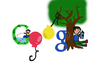
1. Child hood
2. The theme of this design is that I wish the kids interact themselves with outdoors and fun activities. These days, kids seem to be occupied with computers and other electronics, they don’t enjoy the environment around them. I think it’s a waste to not see what the word has to offer.
3. I tried to improve on the design by making the theme clearer. I added in the second child fishing on the letter G. I also tried to make my letters give off a smoother appearance.
4. Three things that I learned from completing this assignment is the combination of colors, a way to make a design look stable, and a way to grab the audiences’ attention. I thought that the use of different colors are very important since it can make a design look attractive and eye catching. It’s crucial to make a design look more stable, so it balances out in pictures. It’s not always necessary that we use outrageous designs to catch the audiences’ attention, because simple designs can make designs look good.
5. I will give about a 3 on this, because of the effort I put into this design. It took a lot of effort to actually draw out all the components of this design. And it was hard to portray the themes in this design, because there are different things that kids might want to do.
 1. Education
2. The theme of this design is that I wish people continued on with their education no matter how old they are. I believe that there are a lot of things to learn aside from education that you get from school. And people tend to take it for granted that we have the opportunity to learn.
3. I did not get feedback on this design, because I completed it after the class we had the feedback session on.
4. Three things that I learned from completing this assignment are the brush tool, and the magic wand tool, and simplicity. The brush tool was helpful in making the design, although it was hard to use it once in a while to get a straight line, it let me draw the designs the way I wanted to. The magic wand tool was also helpful in making the design, because it helped me draw the letters without having to draw them by hand. I also used the idea of keeping it simple and eye catching with bright colors.
5. I will give about a 3 on this, because I like how the design looks simple and clean. I also like how I used the colors of the Google, but it still looks eye catching. And I also got a lot more comfortable using the tools for this design, because there were a lot of parts of the design that needed different tools to be used.
Subscribe to:
Posts (Atom)

