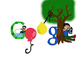
Monday, June 15, 2009

Travel Brochure

magazine cover

Logo Design

Back Betty Blakemen tshirt logo design.
2nd Back Betty Blakemen tshirt logo design.

Front Betty Blakeman tshirt logo design.

Tuesday, April 14, 2009

Pentool Logo Design


1. Name of your company, a short paragraph describing what your company manufactures/sells and the target audience for the product.
The name of my company is called Starfruit. My company sells a product called “fruit bursts” which is a chewy organic fruit snack with liquid filling in the middle, which bursts when the chewy part of the snack gets bitten into. The product contains vitamins that kids don’t usually obtain from chewy candy-like fruit snacks. The target audience for this product is anywhere in between toddlers and young children.

2. Review the processes that Jacob Cass went through in designing his logo and Logo Design Secrets (and any other links that you found especially helpful). What parts of these processes did you use in your work. Please explain and be specific.
Knowing the rules and principles of logo design was very helpful in creating the logo. It talks about “describable, effective without color, memorable, and scalable” The logo has to describe what it is representing. Although sometimes, the logo isn’t what the product is, if it’s not affective of attracting the target audiences, there is no point. Effective without color truly shows if your logo is successful or not, because it shows that the target audiences remembers what your logo is, and what it represents. Which shows the popularity of your product. It brings me to my next point of having it be “memorable” really shows the popularity of it. For example, many people remember the McDonalds’s symbol, and the Nike’s symbol, because their products are popular. Your logo has to be scalable, because if people can’t understand what it is when it’s small or large, it shows how ineffective your logo is.

3. Overall, what three important concepts have you learned about logo design? Explain why they are important to your future work?
The three important concepts that I have learned about logo design is that it has to be simple while attracting the target audiences. I also learned that attracting the audiences without color is a great part in designing a logo. Simplicity always seemed very important to all the designs we have created. It’s the same idea of getting out what we’re trying to say concisely. Attracting the target audiences without a colorful logo is very important, because it shows if your logo is affective or not. Also, if your logo has to be affective without color, I think it’s best that you use an unique universal symbol, or a picture.

4. Review the criteria and the process of designing a logo, please rate your final logo design, 1-4 (4 is the highest). Please explain why your work deserves the rating.
I would give my logo about a 3.5 on a 4 scale, because I’ve used all the principles of creating a logo. I’ve brainstormed my ideas, got feedback, and edited my logos. I’ve also tried to fit it so that I can attract my target audiences, who are anyone in between toddlers and young children. The best part about what I did is that I didn’t focus on just the one idea I have started with. I took the feedback from the class, and made it so that the logo would be better. And I utilized my time in class by researching on products that toddlers and young adults might enjoy.

Thursday, April 9, 2009

Reflection on Logo changes

1. What significant changes has your logo gone through?
First, I started by drawing bunch of asparaguses to represent the company name, “Asparag-us”. But now, it’s just the word asparag-us with the picture of an asparagus on it.

2. Why did you make these changes?
I realized that it looked really messy and I changed it to just the word asparag-us with an asparagus underneath it. I’m thinking about not adding colors to the word, but to the asparagus.

3. How much more work needs to go into the logo? What more do you need to do? (Please check criteria)
I need to find the suiting font for the word asparag-us and the proper color for the actual picture of the asparagus. And also find a suitable size for both of them. I’m also thinking about switching up some ideas.

4. What questions do you have?
I don't have a question at this moment.

Friday, April 3, 2009

Quarter 3 Self-Assessment

What are you most proud of? What do you think are your strengths?
I’m proud of the fact that during the first quarter, I learned how to design on photoshop, when I couldn’t do that before. It shows the improvements that I have made in this class. I think my strengths are practicing the given tools, and exploring other tools to use in photoshop. I also like the fact that I try to use my resources to the fullest. If I don’t understand it, I would search it online.

What would you like to do better and/or focus upon for Quarter four?
I would like to focus on getting better at designing, now that I have the resources and the tools to create the designs. I would also like to get more creative, and inspired by other artists’ work. And I hope that I can spend a little more time on planning my ideas ahead of time, so I don’t waste a lot of time during class. I'll try to focus more on getting my ideas out.

How will you make this happen?
I will try to be more creative, and utilize my time well. Not dwell on just one idea, but explore more about it. Practice more with the tools that we have learned to use in class, and explore other tools. And continue on with being inspired by other cool designs that I see. I will also take more into consideration of the feedbacks given by other students in class.

Monday, March 30, 2009

5 Important Tips In Creating a Logo

1. Remember what a logo is supposed to represent. It’s not just a symbol, it should reflect on what it is representing. It should have a clear meaning to be an effective spokes symbol.

2. The logo must be able to stick in someone’s mind. It has to be able to fit into any description. People usually get drawn to the simplest things… but it also has to be eye catching other words, make it creative.

3. Don’t make the same mistakes that bad logo designers did. Caroline Davidson produced the Nike’s logo for $35, but it’s world’s renowned symbol. It shows that it can be simple yet eye catching.

4. When making a design, don’t copy someone else’s work. Make it creative and be inspired.

5. Practice makes everything perfect, even for creating a logo. Get used to the programs you’re using. And don’t forget to brainstorm on your ideas.

Thursday, March 26, 2009

Tessellation

Rectangular Tessellation
Triangular Tessellation


1. Which tessellation did you find more interesting to do? In what ways was it more interesting than the other? Please explain.
The rectangular tessellation was more difficult and it took more creativity to do. Even though it was harder to do, it was more interesting creativity wise. I also liked doing the triangle because we needed creativity to pick the spot of the picture that would make a unique tessellation. Over all, I think the triangular tessellation looks better as a finished product, just because it creates the unique shapes, and the colors go well together.

2. Look at your peers' work on the ning . Which two designs do you find the most successful? What qualities make them so successful?
The two designs I find is successful are Samantha’s triangular tessellation, and Adrian’s rectangular tessellation. Part of Samantha’s tessellation looks as if it’s glowing near the black color on her tessellation. The colors go well together, and it has a ‘crisp’ look to it. Adrian’s rectangular tessellation looks successful, because its colors are very bright and it’s eye catching. I like how bright it is, and the colors go well together.


3. Looking at the Grading Criteria for each design, how would you rate BOTH designs on a scale of 1-4, 4 being the highest? Please explain each grade.
I would rate it both 4, since Samantha’s design has cool shapes and colors. It’s unique, and eye catching. She made the dark part of the design eccentric next to a bright blue color. On Adrian’s design, her design was the most eye-catching out of the rectangular designs. It’s hard to incorporate many different colors without making it look awkward. I think the use of the rainbow colors were a great idea.

Friday, March 20, 2009

Intorudction to Tessellation


1. What is a tessellation?
Tessellation is form of art that represents animals or other living things in a mosaic floor that doesn’t overlap, has no space in between each tile, and is put symmetrical to the floor or a plane.
2. Write a couple of paragraphs describing the life and work of M.C. Escher. Pick out important facts that describe who he is, how he worked, and why he is famous.
M.C. Escher was born in Leeuwarden, Holland on June 17th, 1898. His family moved to Arnhem, and he went to a high school there. His art teacher in high school taught him linocuts, linocuts is a printmaking technique; and because he was talented at it, he was sent to one of the best graphic artists named Roland Holtz. He suggested that he try it with wood, but since he failed his school exam, Holtz suggested that he became an architect. From 1918 to 1922, Escher studied in the School for Architecture and Decorative Arts in Haarlem. He became close friends with his teacher, Mesquita who was later sent to concentration camp. And Escher developed his skills in woodcutting.
In 1922, he took a boat trip to Alhambra, Spain, which influenced him with many tiling patterns. He also visited Italy, and he met Jetta, who was to be his future wife. They got married and stayed mostly in Rome until 1938. During this time, he traveled around the southern coastline, and many of his landscape were influenced by it, like the Castrovalva. In 1925, he created his first tessellation, which is called Lions. It was not very successful. In 1937, his brother helped him out with wallpaper designs that were created by George PĆ³lya. Professor F. Hagg also influenced him in developing the Layman’s Theory. He created about 137 tessellation designs before his death. His last tessellation was solution that he solved to a puzzle given to him by a mathematician names Roger Penrose.

Sunday, March 15, 2009

Doodle For Google


1. Child hood
2. The theme of this design is that I wish the kids interact themselves with outdoors and fun activities. These days, kids seem to be occupied with computers and other electronics, they don’t enjoy the environment around them. I think it’s a waste to not see what the word has to offer.
3. I tried to improve on the design by making the theme clearer. I added in the second child fishing on the letter G. I also tried to make my letters give off a smoother appearance.
4. Three things that I learned from completing this assignment is the combination of colors, a way to make a design look stable, and a way to grab the audiences’ attention. I thought that the use of different colors are very important since it can make a design look attractive and eye catching. It’s crucial to make a design look more stable, so it balances out in pictures. It’s not always necessary that we use outrageous designs to catch the audiences’ attention, because simple designs can make designs look good.
5. I will give about a 3 on this, because of the effort I put into this design. It took a lot of effort to actually draw out all the components of this design. And it was hard to portray the themes in this design, because there are different things that kids might want to do.
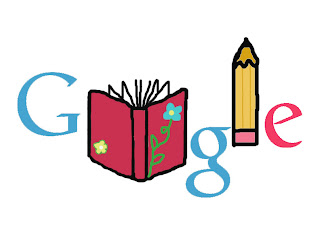
1. Education
2. The theme of this design is that I wish people continued on with their education no matter how old they are. I believe that there are a lot of things to learn aside from education that you get from school. And people tend to take it for granted that we have the opportunity to learn.
3. I did not get feedback on this design, because I completed it after the class we had the feedback session on.
4. Three things that I learned from completing this assignment are the brush tool, and the magic wand tool, and simplicity. The brush tool was helpful in making the design, although it was hard to use it once in a while to get a straight line, it let me draw the designs the way I wanted to. The magic wand tool was also helpful in making the design, because it helped me draw the letters without having to draw them by hand. I also used the idea of keeping it simple and eye catching with bright colors.
5. I will give about a 3 on this, because I like how the design looks simple and clean. I also like how I used the colors of the Google, but it still looks eye catching. And I also got a lot more comfortable using the tools for this design, because there were a lot of parts of the design that needed different tools to be used.

Saturday, February 28, 2009

Thursday, February 12, 2009

Thursday, February 5, 2009

Type Design


Self-Assessment

1. Are you happy/satisfied with your design? What are some of the features that make it so successful? If you are not satisfied, what would you have done differently to make it more successful?

Yes, I am both happy and satisfied with my design. I think some components that helped me was that the color scheme was balanced well throughout the design. I also planned out how the design may have looked before hand. The use of the lines for our focal points were very helpful when I started my design. I experimented with color, opacity, and the position that the letters and the background were placed on.

2. List some of the tools that you learned and used in this assignment. Which ones did you find the most helpful and in what ways?

During the making of the type design, I learned how to use the eyedropper tool, the rectangular marquee, the paint bucket tool, and the text tool. All of the tools were important in the process of making the type design but in a lot of times, I thought that the eyedropper tool was very helpful in achieving the similar color or the shade with the color near it to balance out the design. The paint bucket tool was also helpful when we were making the color of the letters and the background layers, because we didn’t have to use the brush tool and color it in and waste time. The rectangular marquee was also helpful because we could make different sizes and shapes of rectangular we wanted for our designs. The text tool was also helpful, because it would be hard to create letters if we didn’t have it. I liked the fact that if we picked a font, we could just make it larger and stretch it out to fit our designs.

3. With what areas/aspects of Photoshop do you have questions? What activities would help you better understand basic design concepts, along with more Photoshop tools, tips, and tricks?

The areas or aspects of Photoshop that I have questions on are how to make the pictures look more natural. I think learning the basic background of some designs like we did with notan, will help us be better when we create a more complicated design. I’ve noticed that while we work on our designs, we get more comfortable with the tools that we have used before. We also get to practice using new tools when creating a new designs. I think it’s best that we learn the tips and tricks and just remember how we used them in order to be faster and a better designer.

Monday, February 2, 2009

Pop Art

Pop art represents short words, and it gives a bold meaning to them. The words are shaped into geometric forms.They are usually wooden blocks with bright colors to grasp the viewers’ attention. Indiana’s pop arts usually represent culture and life.

Stuart Davis-

Stuart Davis is an American painter, who was born in 1894. He had many influences while he was growing up, since his father was an art director for a Philadelphia newspaper. Davis later worked with Robert Henri from the years 1910 to 1913, and he created covers for a realist periodical called The Masses. After visiting Paris in 1928 to 1929, he learned the idea of cubism, where he used natural forms to express the characteristic of an American life. I like his work called Report from Rockport from 1940, because it really represents the way of life of a typical American. I’m assuming that it’s a street where people interact with their neighbors. You can also see the natural side of this drawing, where the clouds are represented with different colors. You can also see the landscape of mountains in the back. And People going on about their lives.


Robert Indiana-

Robert Indiana is an American painter who was born in 1928. He studied Munson-Williams-Proctor Institute in Utica, New York, which led him to study in School of the Art Institute of Chicago. From the Institute of Chicago, he won a traveling fellowship to Europe, and ended up studying in Edinburgh University and Edinburgh College of Art in Scotland. He got his ideas from Longfellow, Whitman, and Melville, who are known famous for their anti-transcendentalistic and transendentalistic ideas in writing. Indiana is very famous for his pop art designs for the words Eat, Love, and Die. And he is most famous for his pop art work for the word Love used on postage stamps in 1973. I like his work called The American Love from 1975. It represents his style of designing, which reflected upon the American pride. It is shown in the red, blue and white colors with the word Love formed into different forms. It also shows the ‘transcendental’ ideas from Whitman, which can be found from his poem I Hear America Singing.

Friday, January 30, 2009

Tuesday, January 27, 2009